Introduction
Epiphany RBC is a market research consultancy, quantitative research is at the heart of what they do. I started my journey managing the UX of their online surveys when it became clear that the problem was not specific to Epiphany, but structural to the entire industry. At the time, online surveys across the world were built on legacy software that failed to meet even basic UX design standards.
I am leading this project that I started 5 years ago as an exploration of what the future of quantitative research could look like. Over time, it had evolved into an end-to-end product that replaced the many separate tools Epiphany had been using to run their projects. The solution is proved so effective that the product eventually became its own company: Twentyeight Conversation.
I am leading this project that I started 5 years ago as an exploration of what the future of quantitative research could look like. Over time, it had evolved into an end-to-end product that replaced the many separate tools Epiphany had been using to run their projects. The solution is proved so effective that the product eventually became its own company: Twentyeight Conversation.
Introduction video created in 2023 for the product launch. The product has continued to evolve since then.
The Challenge
Most people don't enjoy filling out online surveys. They're often long, repetitive and clunky. When a survey feels like a chore, people disengage, attention drops, and participation turns into a race to finish as quickly as possible. As a result, a large part of the data collected is not usable, because people speed through questions or give the same answer repeatedly. For researchers this means bad news, because the data quality is compromised.
Most people don't enjoy filling out online surveys. They're often long, repetitive and clunky. When a survey feels like a chore, people disengage, attention drops, and participation turns into a race to finish as quickly as possible. As a result, a large part of the data collected is not usable, because people speed through questions or give the same answer repeatedly. For researchers this means bad news, because the data quality is compromised.
The question then becomes: How can we design an online survey experience that is engaging enough to make people actually want to share their opinion? Most panel respondents are indeed there for the incentive, but that doesn’t mean they don’t have real opinions. If the experience itself is good enough, we might be able to change their motivation—from just finishing the survey to actually participating in it.
The (Current) Solution
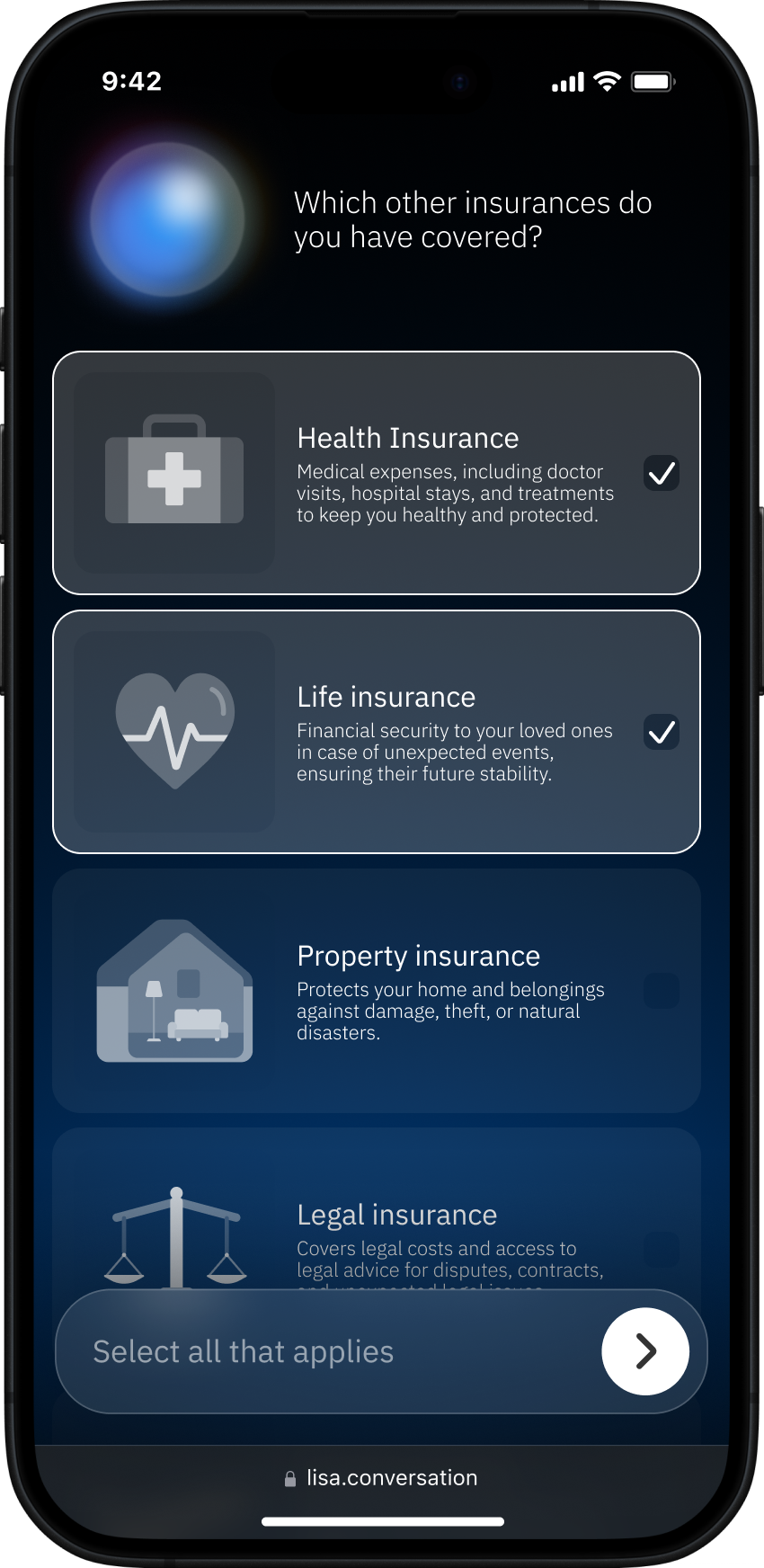
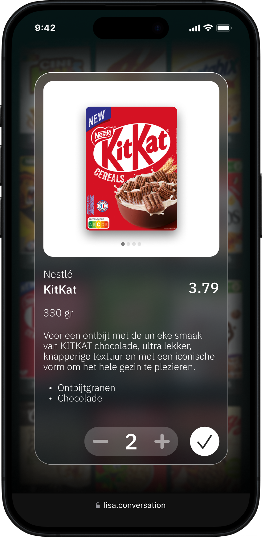
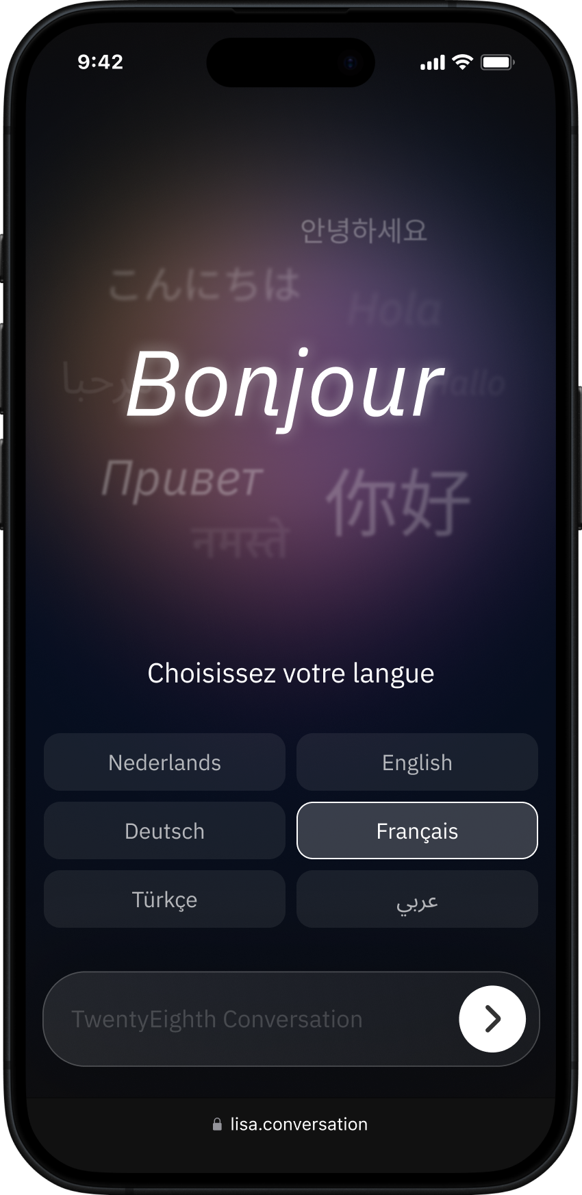
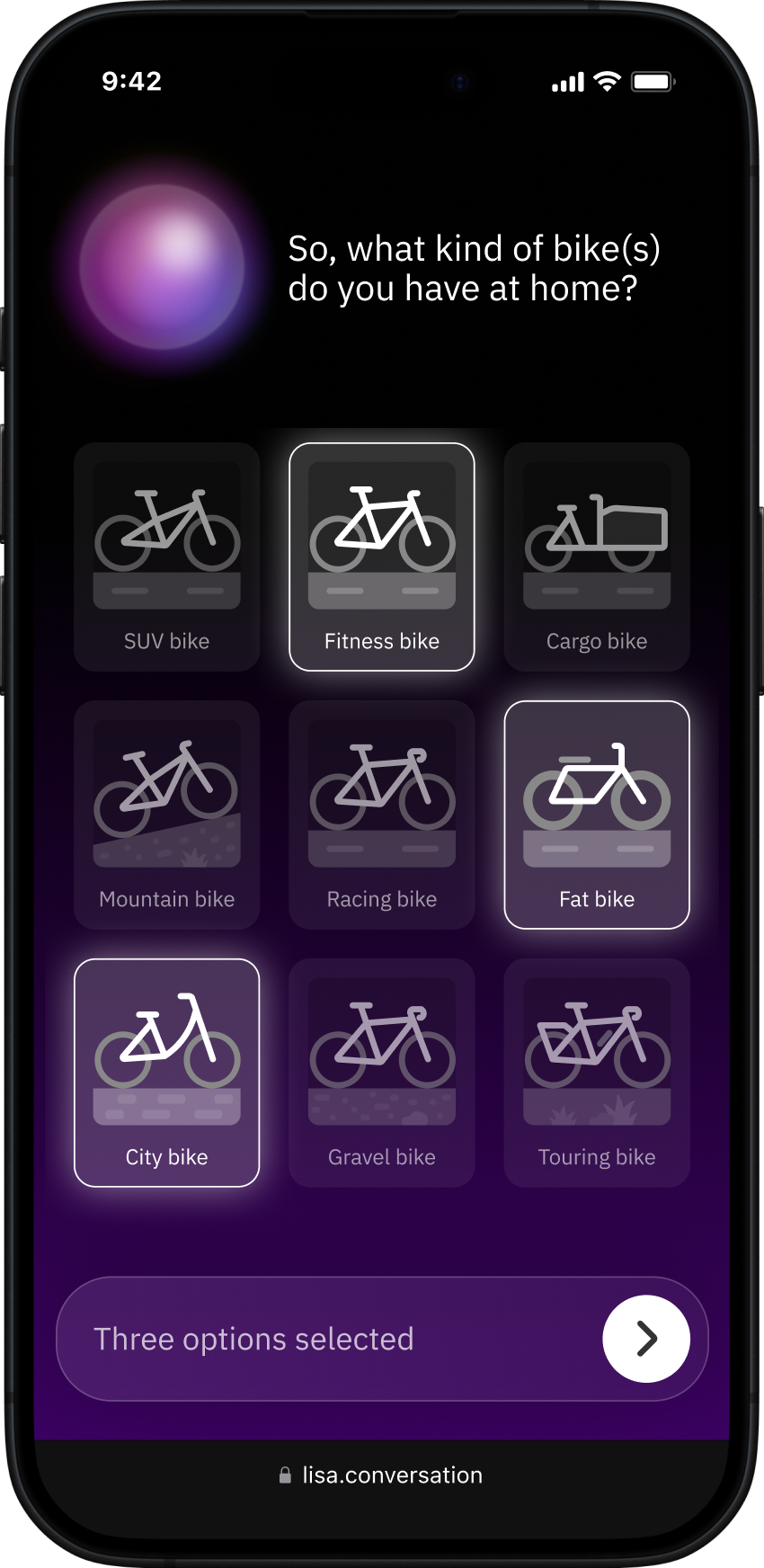
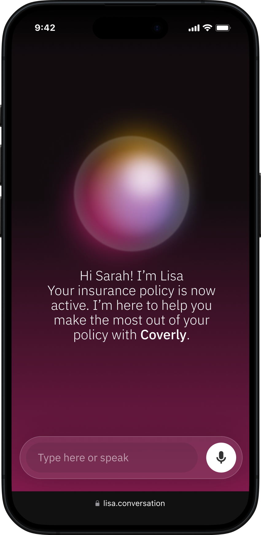
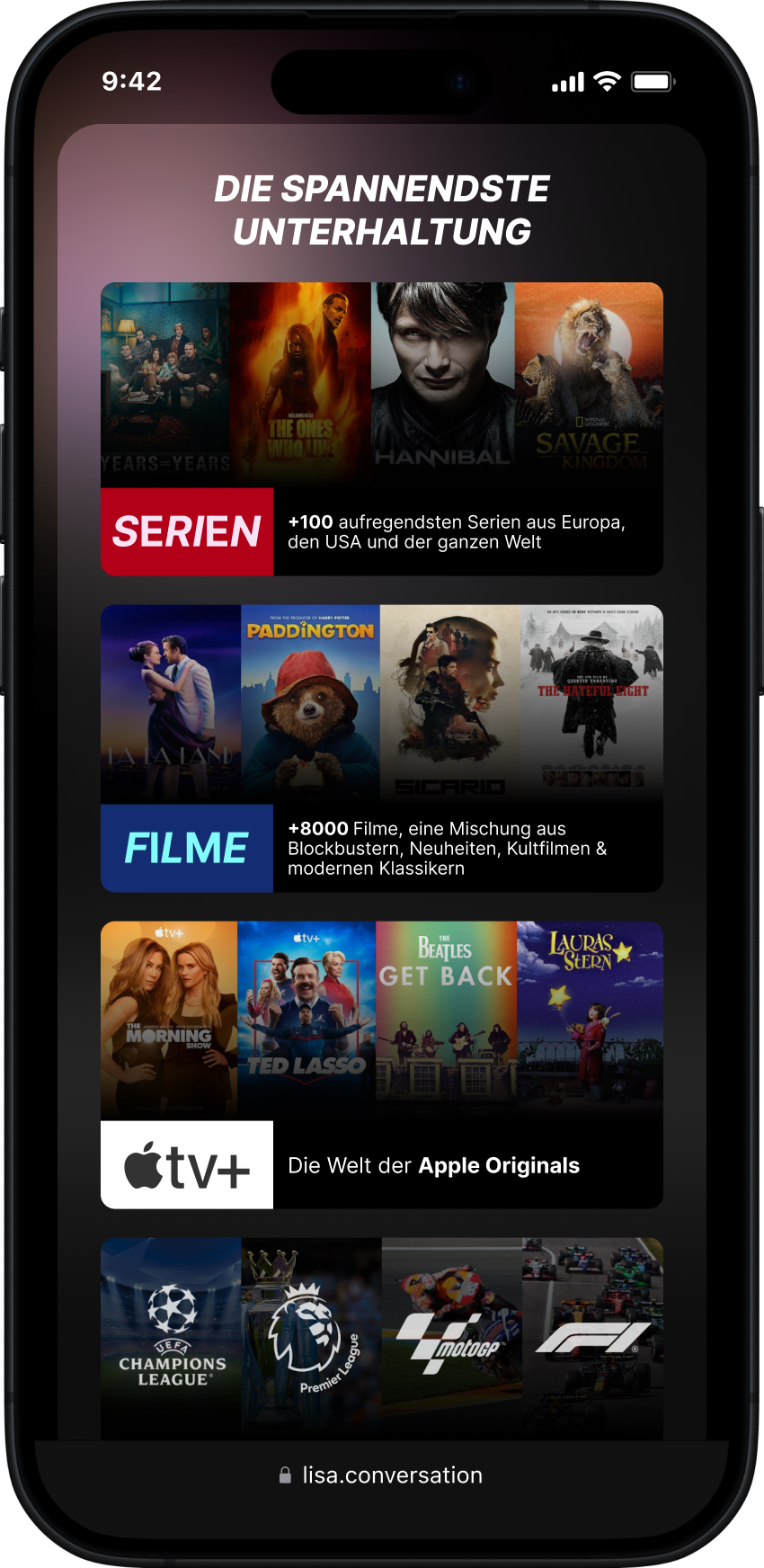
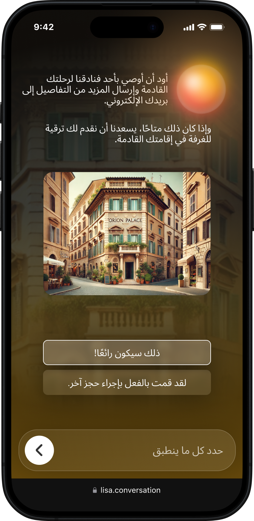
The current solution is a survey interface designed to feel closer to a modern web experience than a traditional one. It is highly visual and uses micro-interactions and subtle animations to make the experience feel responsive and engaging. At the same time, the moderator, Lisa, is built with intelligent features that allow the conversation to adapt in real time based on how people respond, rather than following a fixed, linear flow.
Reaching this solution was an iterative process. Many different directions were explored along the way, including gamification, personalisation, AI avatars, and even virtual and augmented reality. Through continuous testing, iteration, and learning, the focus gradually narrowed to what it is today. I do not see this as final state, but as a solid foundation, one that continues to evolve as new insights emerge and the product roadmap grows.
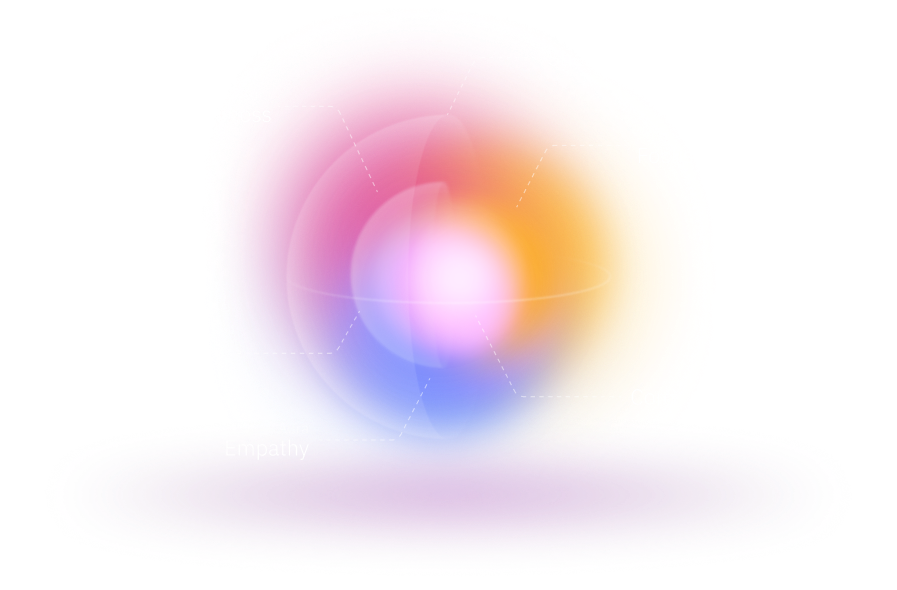
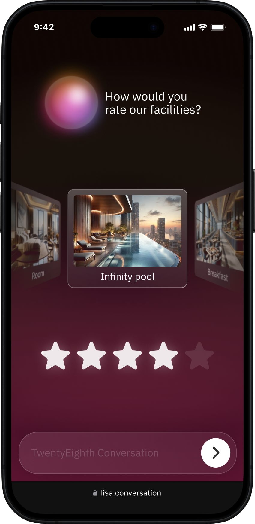
The anatomy of Lisa. As she engages with the respondent,
Lisa adapts: shifting color, focus, and behavior in response to sentiment.


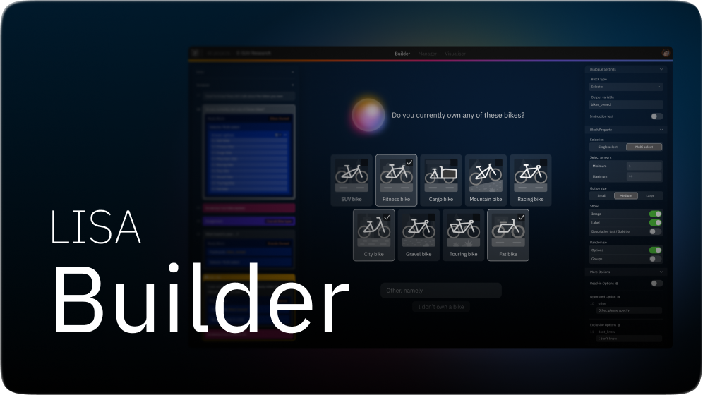
The Tools Design
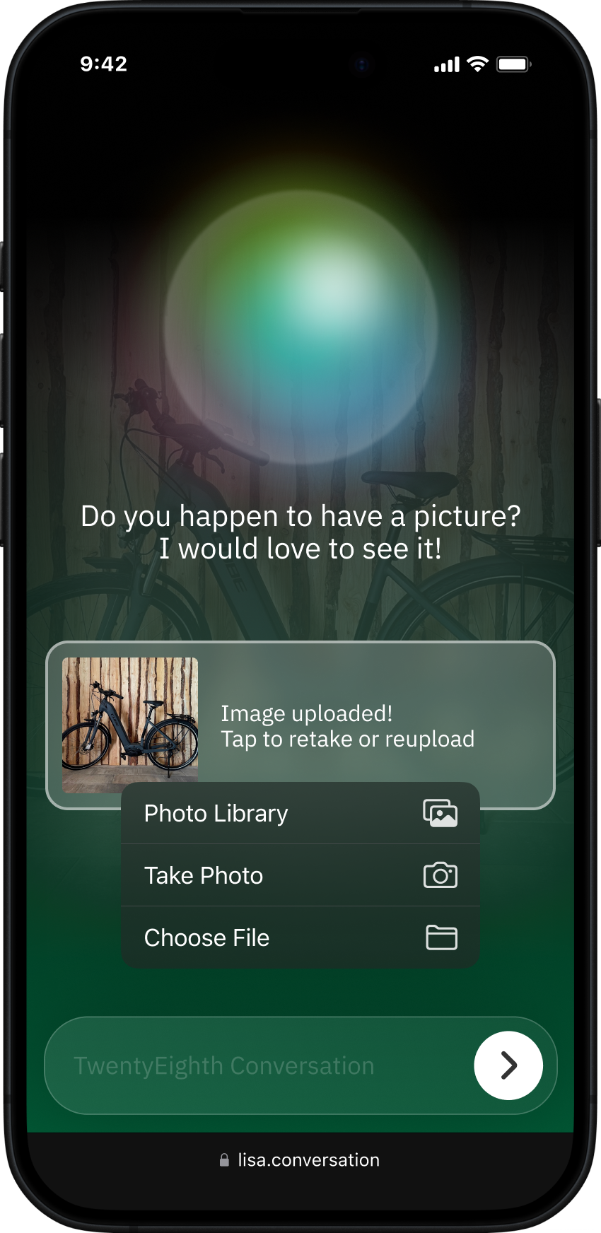
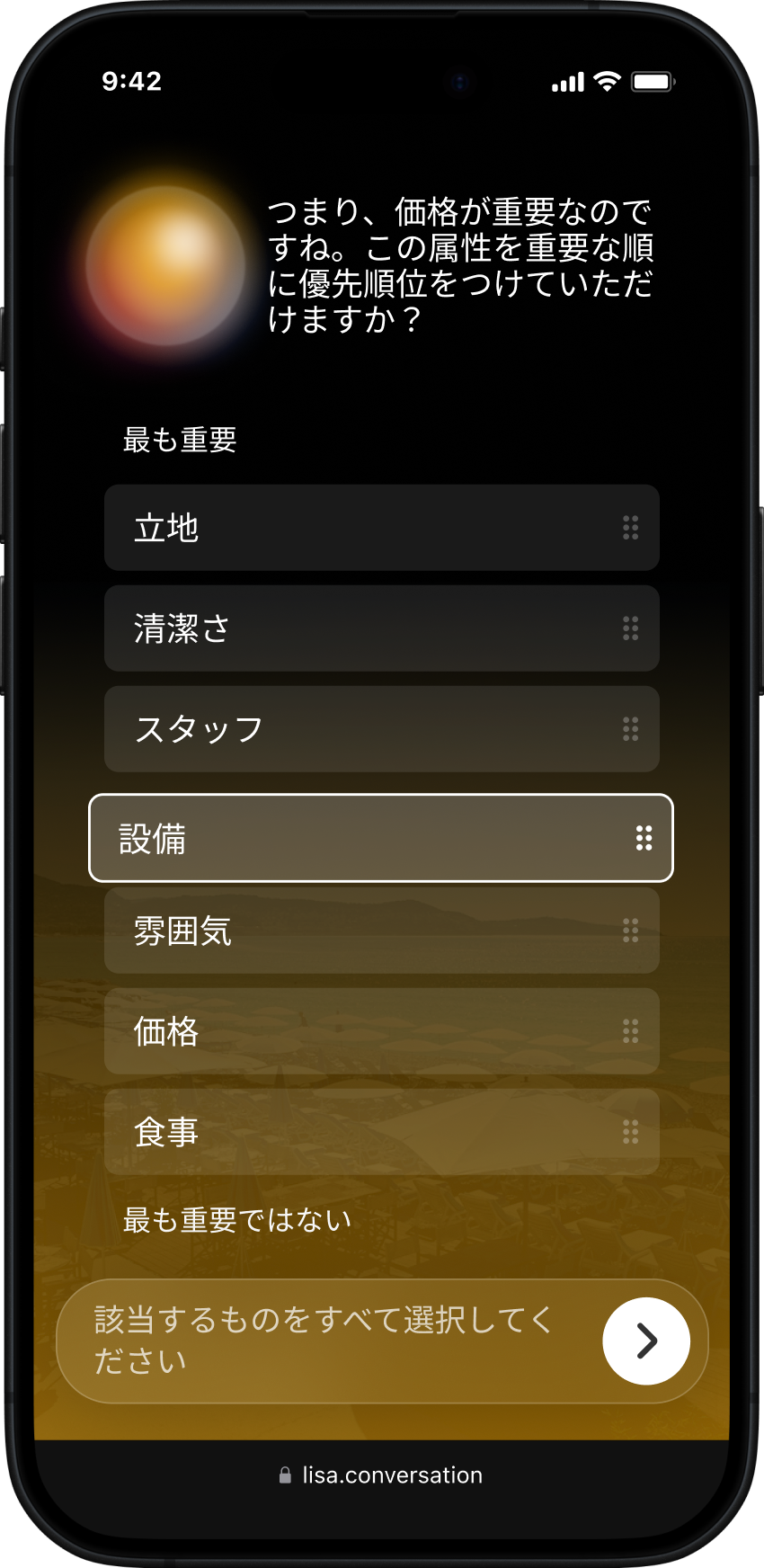
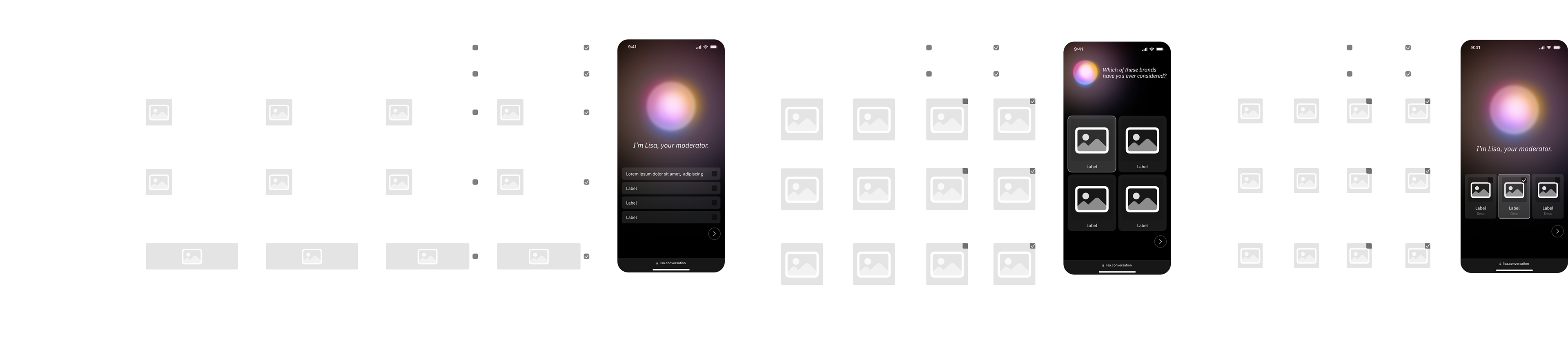
Over the course of the project, I designed more than 15 different tools that allow respondents to interact with Lisa and provide their answers. These range from simple inputs such as buttons, text fields, and sliders, to more advanced and immersive tools like supermarket shelves, e-commerce layouts, and Conjoint Analysis. All tools are modular by design and can be combined to create more complex exercises. For example, flashcards combined with scales form a card-rating exercise, while media cards combined with dilemmas create a Tinder-like interaction.
Each tool is highly interactive and designed to work across a wide range of scenarios. Even the most basic tools, such as selector buttons, support many variable properties. Combined with factors outside of direct control (like screen size or the number of options) this results in almost infinite variations. The challenge was to create a design system that remains clear, consistent, and usable across all of these situations, and that works reliably in nearly every scenario.
The Implementation
Though I am mainly a designer, I regularly contribute to the Front-end of the application. The Conversation interface is built with Vue.js. It follows a block-based architecture where each tool (OpenEnd, Selector, Scale, etc.) is a self-contained component. This makes the system flexible and easy to extend as new interaction types are added. Styling uses design tokens created with Tokens Studio converted into CSS variables across platform-specific files (mobile, tablet, desktop). Interactive animations like Lisa's behavior are created using Rive, while layout transition uses Vue's built-in transition component.
Though I am mainly a designer, I regularly contribute to the Front-end of the application. The Conversation interface is built with Vue.js. It follows a block-based architecture where each tool (OpenEnd, Selector, Scale, etc.) is a self-contained component. This makes the system flexible and easy to extend as new interaction types are added. Styling uses design tokens created with Tokens Studio converted into CSS variables across platform-specific files (mobile, tablet, desktop). Interactive animations like Lisa's behavior are created using Rive, while layout transition uses Vue's built-in transition component.

The Impact
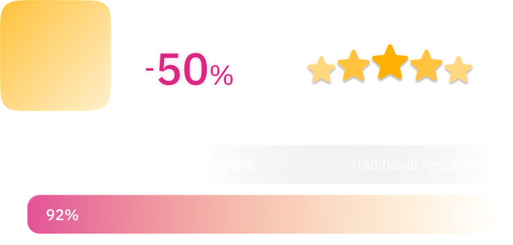
In summer 2023, Lisa was tested in a pilot project alongside the existing old setup. It was a real client project, running in parallel as an A/B test. Lisa performed better in all key metrics: fewer dropouts, richer answers, and higher overall data quality. At the end of each conversation, respondents were asked for feedback, and the vast majority responded 'very positive'. By 2024, all new and existing projects at Epiphany RBC were running on Lisa.
In summer 2023, Lisa was tested in a pilot project alongside the existing old setup. It was a real client project, running in parallel as an A/B test. Lisa performed better in all key metrics: fewer dropouts, richer answers, and higher overall data quality. At the end of each conversation, respondents were asked for feedback, and the vast majority responded 'very positive'. By 2024, all new and existing projects at Epiphany RBC were running on Lisa.
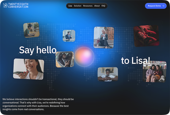
Lisa also became a core part of Epiphany’s value proposition, helping strengthen existing client relationships and attract new ones. Over time, more companies started using Lisa for their research, including Booking.com, Uber, KPN, ASICS, and Nestlé to name a few. In 2025, the product became a separate company: Twentyeight Conversation, making Lisa available directly to businesses without the need for Epiphany’s consultancy services.
Website of Lisa (opens in new tab).
Continue reading ...
Want to know how researchers build the conversations and analyze the data?
Read more about the Lisa: Builder
Want to know how researchers build the conversations and analyze the data?
Read more about the Lisa: Builder